
The back of the 3CURVES design is, well, neither good nor bad, just BORING. It only looks intersting when surrounded by gray black navy suited CEOs trying to look important. In THAT context the back looks OK.

There are TWO of my recently arrived new designs here---the 3CURVES design and the SIDERIVER design. I have worn each one for a day and my conclusion----LOUSY. These are experiments that did not work. BECAUSE I dislike them I will wear them quite often---if you do NOT understand ask your wife or girlfriend.
All my designs look interesting on paper --- (to me at any rate) but THAT is why designers BUILD STUFF---because stuff when in STUFF format often is NOT stuff when in sketch format. Try it with wives or husbands or kids---the real version differs from any sketch.
There is so much I dislike about both these designs I do not feel like listing it---just about everything is bad. There are a couple of elements to pull out and use elsewhere---the top third of the front of the 3CURVES design is neat--that can be salvaged elsewhere.

t
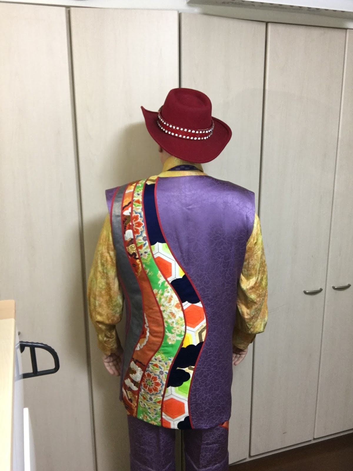

The back of the 3CURVES design is some sort of disease encrouaching on the purple material---overall making a creepy effect. WHAT WAS I THINKING???? This has happened many times before, however---my closet is filled with bad results----that is how I filled it with GREAT results.
The front of the SIDERIVER design is amazingly bad in proportions. If the striped side were 1/5th as wide, then OK. WHAT WAS I THINKING?
No comments:
Post a Comment