Tuesday 9 February 2016

Richard's Wear 9feb2016tuesday

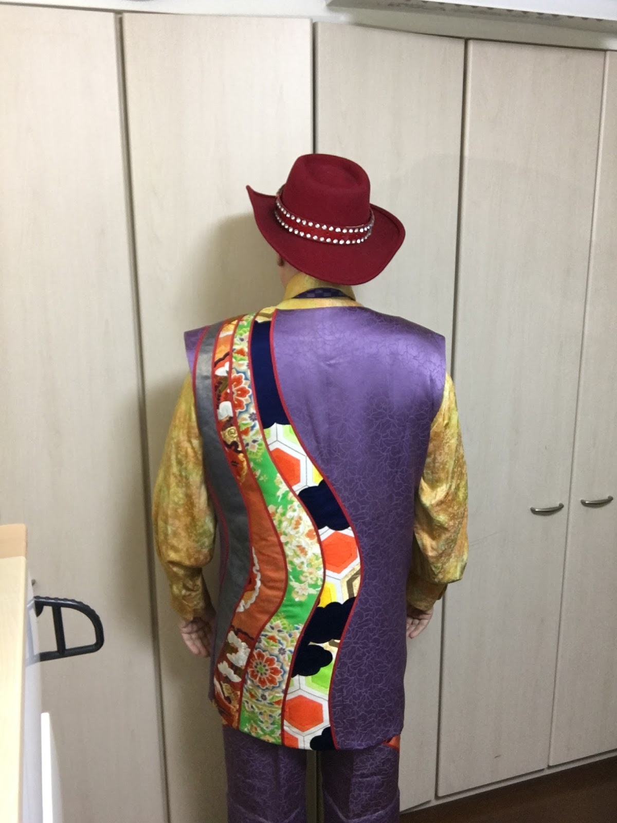
 This outer jacket is old, my Lt. Warf design.   I has cascading collars in the front and I have worn it in enough venues to say, with confidence--this is a BIG HIT.   People WANT IT.   I thought at the time of design it would be out there, beyond everyone, but what do I know?
 The back of the Lt. Warf jacket has a triangle shaped remove-able section for coolness in summer wear.   As a joke I thought I would make the triangle section, well, a bit......trangular!


The key to this jacket is the split accordian sleeves---so easy to move in---I have played tennis in it with no errant shots caused by stiff material or limits on motion.   
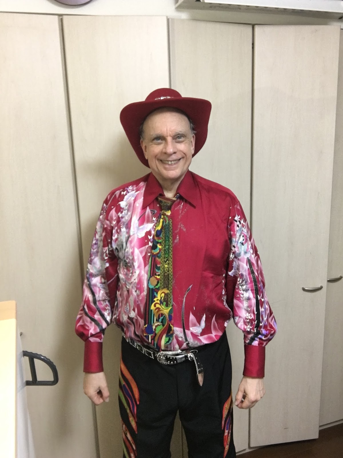
 This is the 7th design out of 8 new recent ones arrived (another that I called 7th was actually 6th).   A few designs ago I tried out a small STAINED GLASS section and liked it, so HERE it is the entire front--having worn this for a day I can say with confidence---I LIKE THIS and the people around me in Japan---LIKE THIS.   

As usual I am completely surprised by which designs people take to and which they reject.   This one was a bit too crowded and bold and childishly over-colored I thought but then I LIKE IT in spite of that and OTHERS not my friends LIKE IT in spite of that too.
This is the same back I used on other recent designs---it did NOT work on light and brightly colored background materials but it WORKS on this dark BLACK background.   I will repeat it in the future on dark background fabrics like this one.  


MY AIM IN ALL THESE DESIGNINGS---1) do stuff I personally like and want to wear    2) amaze the world dominating every room and event and venue visually    3) put to shame COUTURE cowards and their tasteless rich customers.    No 17,000 Dollars US bespoke suit attracts young ladies as well or long as nearly all my designs do---duh.   

Saturday 6 February 2016

Richard's Wear 6feb2016sat design 7 out of 8

 I keep offering to design things for my wife BUT she sees ALL my experiments, successes and failures and the latter scare her off I think.  She has good taste on her own so in public we look appropriate to each other. 

This jacket front of cascading collar shapes I have done before two years ago with a set of outer jackets that won my first fashion prize.   SOOO I thought why not again.  

At present, having worn this just one day, I am OK with it---and think I like it some.   As you can see from 2 or more meters away the effect is----slimming, elegant, visually stunning, and of course unique.   


This is the same old red kimono shirt as last week but I changed the collar.  All my kimono shirts have 2 or 3 remove-able collars.  

WIth a shirt like this you dominate visually every venue.   Women compete by baring more and we men can compete by outre adornment at the sub-clown level.   
 The obi patches on the pants leg---are quite useless and rather tasteless.  Their sole function is the SUIT impression of matching jacket and trousers--that is all.  I did not get myself UP to thinking carefully about what to do with the trousers except recently ALL my long pants are convert-able into shorts by removing the bottom segment.   Global HOTTING is upon us, afterall. 
The back of this jacket is my usual shitty nagare design that on other recent designs I hated.  On BLACK however this shitty stuff works well I think.   Note the bird in silver white from the original old lady black kimono material I used as background material.  

Tuesday 2 February 2016

 This is the 4th of 8 new designs that arrived this week.   The shirt is old--a year or two---from simple red kimono----very comfortable with replace-able extra collars and zip front, wide at elbow sleeves, and extra long sleeves.   
 The suit is kimono with white-silver obi material patches. The suit coat is long as I like that extra length but the sleeves though they should be long are short due to lack of material (and I was too lazy to find filler material).   
This suit is highly expressive of my inner nature---so I like it.  It is ME in a deep sense---my daily actual mood.   

I did what the research books recommend---worked almost entirely in college (at MIT and Wellesley) on making a FINE SELF---not career prep, not engineering tinkerings, not money grubbing "venture" this and thats of today.   I worked on deep inner things---expanding my mind, getting OUT of my hometown culture and ways, escaping 99% of what was IN ME.    I left me to become by age 55 an actual adult--someone NOT a copy of environments they were raised in.

This suit is adult to me---it celebrates life and being alive and thumbs its nose at gray suited fit in cowardly business"men".  It challenges all to LIVE.

The back of the coat is BADLY DESIGNED---the bands are too wide about five times wider than would be good BUT here because the material of the vertical bands is almost the SAME color as the background material, only one band stands out, making the effect good.   So I dodged a bullet here.   

By change the red shirt and red trim and red hat go together.  Too bad I lack Wizzard of Oz red shoes.  

I had 8 new designs this time and two of them are big mistakes, 2 are OK but not great, and 4 are GREAT---I have already lined up material to use for new suits repeating the format of the GREAT ones.    

Later in this blog I will combine one photo from all 8 designs and comment on which are great, which are OK and which are terrible.   

Monday 1 February 2016

Richard's Wear 31Jan2016Sun 1feb2016mon TWO NEW DESIGN, BOTH I DISLIKE

The back of the 3CURVES design is, well, neither good nor bad, just BORING.   It only looks intersting when surrounded by gray black navy suited CEOs trying to look important.  In THAT context the back looks OK.   
 There are TWO of my recently arrived new designs here---the 3CURVES design and the SIDERIVER design.  I have worn each one for a day and my conclusion----LOUSY.  These are experiments that did not work.   BECAUSE I dislike them I will wear them quite often---if you do NOT understand ask your wife or girlfriend.

All my designs look interesting on paper --- (to me at any rate) but THAT is why designers BUILD STUFF---because stuff when in STUFF format often is NOT stuff when in sketch format.  Try it with wives or husbands or kids---the real version differs from any sketch.

There is so much I dislike about both these designs I do not feel like listing it---just about everything is bad.  There are a couple of elements to pull out and use elsewhere---the top third of the front of the 3CURVES design is neat--that can be salvaged elsewhere.

 t

The back of the 3CURVES design is some sort of disease encrouaching on the purple material---overall making a creepy effect.   WHAT WAS I THINKING????    This has happened many times before, however---my closet is filled with bad results----that is how I filled it with GREAT results.


The front of the SIDERIVER design is amazingly bad in proportions.   If the striped side were 1/5th as wide, then OK.  WHAT WAS I THINKING?