I have a weakness for purple especially purply purple. Perhaps I am a self appointed King of a tiny tiny kingdom--everything within 20 centimeters of me.
This suit is a favorite, not by layout or style or impact, but just by the juxtaposition of a favored purple material (stretch as usual) with contrasting colors that manage not to be entirely gaudy.
I love this shirt, collar replaceable as usual, enlarged cuffs and sleeves (at elbow) out of gold with green stains kimono material, zip front (as always- I have buttons). It is SO comfortable compared to the crap materials of men's shirts.
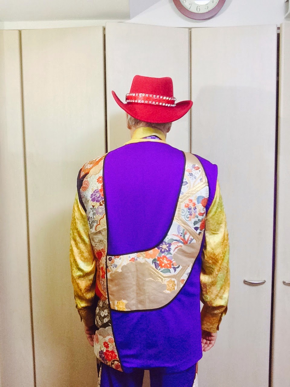
This front pleases me--I designed it to be worn open as at left and worried that it would make my stomach appear bigger--but then I lost 24 kilograms and could not find 15 of them so I am less round. I still lose weight each week, slightly, but am gaining muscle due to 40 min of weight lifting each night from 10 to 10:45 pm. Not sure I like the red hat with this but too cheap to find a purple hat.
This back pattern was just a refusal of pattern. I wanted a mostly vertical thingy but without apparent intent--so I got what I wanted but do not really love the result. It was something I tried--perhaps there is something in this that I can identify, purify, and turn into something great in another try.
In coming months I have a sliver and gold on black project with 3 suits per order not ten--each more elaborate. I will do my version of Yoji Yamamoto, the fewest things for the most impact--we will see.
This is the front fastened--again it WOULD have made me fat had I stayed at my prior weight but I lost weight so the doubling of fabric here does not make me rotund. Nice. I like the overall effect--so obviously anti-Calvin-ist---so liberated from the pale sad cast of employee-dom that culminates in 7000 US$ Italian cut boring blacks and greys. YUK
This is the same suit with a gold silk scarf from China--actually a shawl folded over. It is VERY comfortable though in general Chinese silks are much less strong and much poorer in design than Japanese silks.
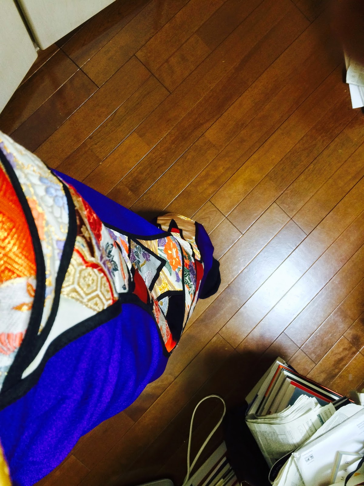
Two obis of contrasting colors are combined in a curved long wave down the pants leg here.
The back of this jacket is this sort of propellor pattern. I do not like it at all now, I underestimated the beauty of the basic materials. Unfortunately I never make my stuff using the best kimonos, uchikakes, and obis I now possess--I always use 2nd or 3rd best, as I am afraid to waste the best stuff on any design. Here, years later, I can admire the quality of basic component materials and lament their bad assembly patterns, especially here. What a stupid design.
The front of this jacket greatly pleases me. It does everything I want done, including not to un-subtle asymmetry.
The kimono material from which this shirt is made is wonderful (blow up the size and you will see. It handles light gorgeously, reflecting in all directions 3 related colors and 4 reflectances. My goofy looking face here is why professional models avoid having any facial expression--most faces look goofy most of the time. Goofy and high pricing do not go well together--"June and Joe, pay 20,000 US dollars for this goofy looking shirt"--naw, that does not work.
NOTE--I fondly wish some terrorist would destroy all copies of Time New Roman fonts so we all would not expend our limited time on earth constantly changing default fonts!!!!!!!